Photos and Features
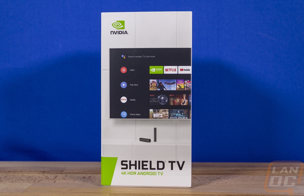
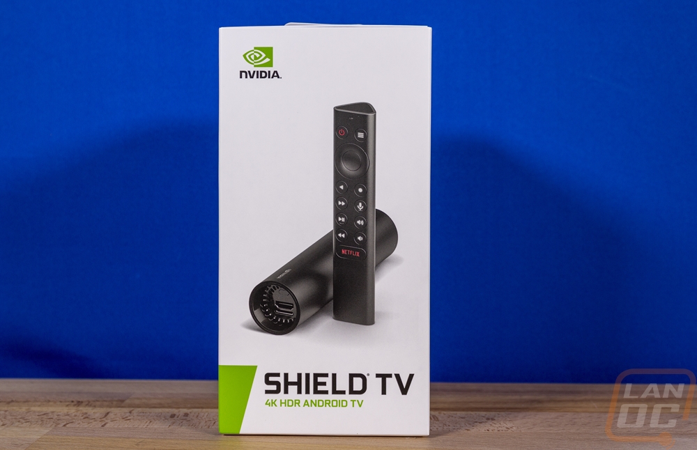
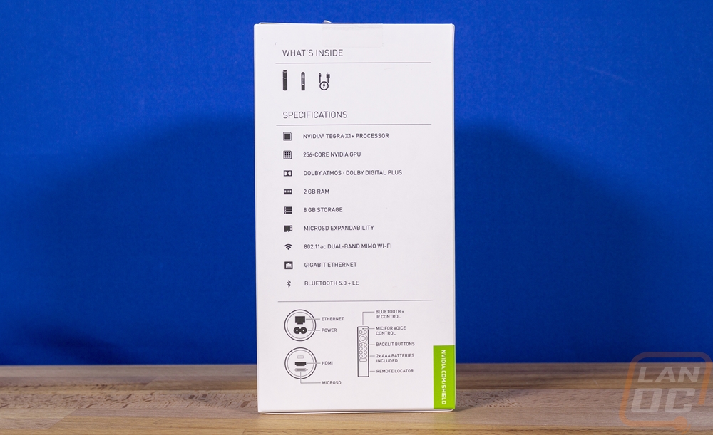
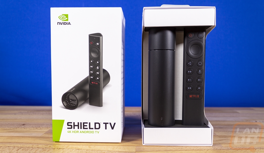
Well, the packaging for the new Shield TV might be smaller, but the same white background with green trim is used again. They also have a nice photo of what you get inside including the Shield TV and remote on the front as well, just like before. Down along the bottom they have the Shield TV branding along with 4K HDR and Android TV which does help show what you are getting. I should point out that Nvidia has once again stuck with the same branding so you have to rely on seeing that this is clearly not the same model as the previous two but thankfully at least on Amazon they have this listed as the Shield TV 2019 so there isn’t confusion. Around on the back, they have the same branding only with a picture of a TV with the software rather than a picture of the hardware. Then on the side of the box, I love that they do include a specification listing, line drawings that show the connection options and remote, and a line drawing of what is inside the box.
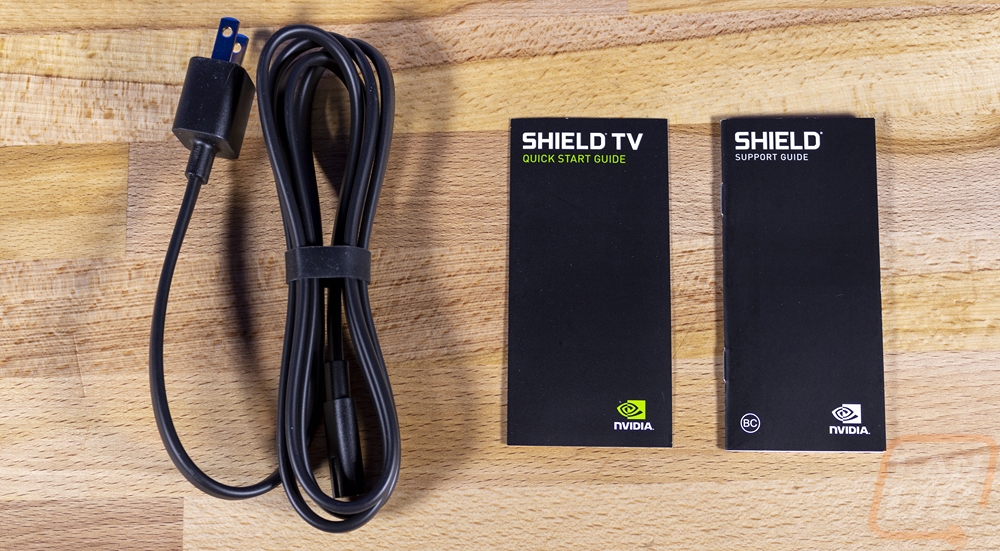
To open the box up you cut the seal and pull the top off and there are top and bottom caps with foam that are holding the Shield TV and the new remote kind of like a display. It's almost a shame that the front of the box didn’t have a window. Behind those two there is a small box with the accessories and documentation. I say accessories, but it is just this one power cable and then a quick start guide and support guide. I do have to point out that the power cable has changed once again. The past two designs have been different each time as well, but this one is especially cool because it doesn’t have a huge wall wart anymore. There is just the small plug which might have some sort of small AC/DC adapter built given its shape but the other end of the cable looks like an older IEC320 C7 which is an older two-prong AC plug that you would find on boom boxes and some TVs before the three-prong that you see on PCs became popular.
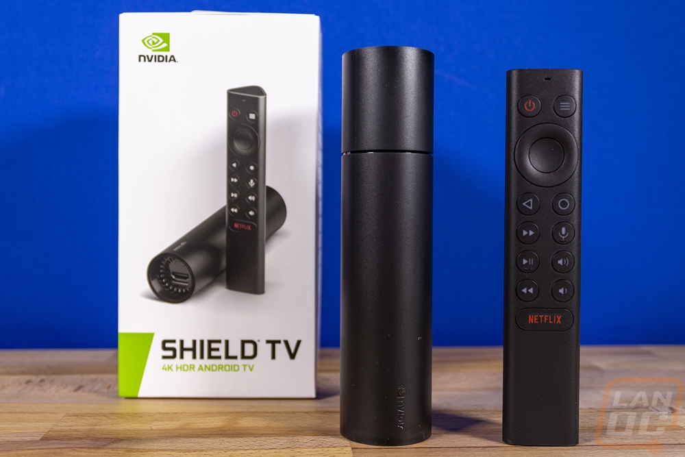
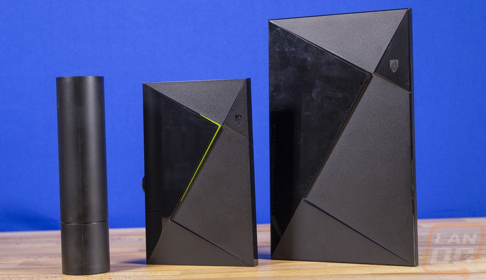
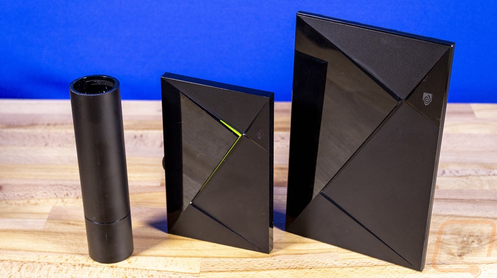
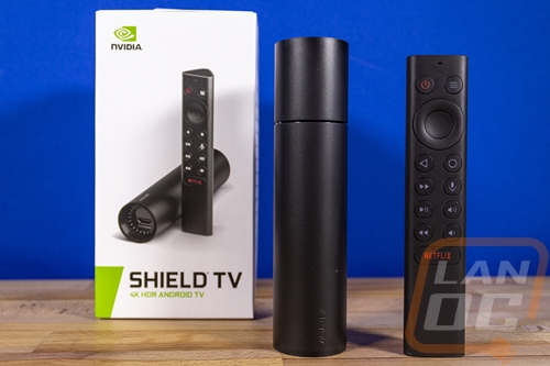
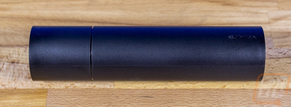
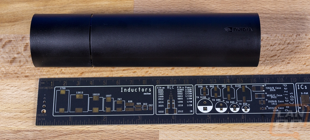
Without a doubt, the new design for the Shield TV is significantly different from past designs. The Shield TV Pro 2019 does still keep the same shape as the 2017 model, but the standard model is a tube. It is just about the same size as a toilet paper roll, only longer and if you asked me before they announced it what would be different about the Shield TV I would have never guessed that it would look anything like this. Now the idea for the design does make some sense. Similar to how a Chromecast, Roku, or Firestick works they wanted to go away from the tabletop design for a more hidden design and packing the power of the Shield TV into a small form factor like the Firestick isn’t possible but this design lets you put this inline back behind your TV with all of the connections on the ends. It has a black plastic housing with the Nvidia logo on it and just one ring on the one end, no extra lighting and none of the angular design elements that the past Shield TVs have had.
What is most surprising though is fitting the Tegra X1 architecture from past Shield TVs into this much smaller design. They did this by moving to a new Tegra X1+ SoC design which they suggest is 25% faster than the original Tegra X1 design. It is built on 16nm where the original was on 20nm architecture. It has the same Cortex A57 combined with Cortex A53 combination with 4+4 cores and the Maxwell-based GPU but the CPU now runs at a higher clock speed (1267MH vs 1000MHz). This model has 2GB of RAM which is down from the 3GB of the past models and 8GB of NAND which is half of the previous 16GB. Seeing the ram and NAND drop is capacity is a bummer but you do still at least have MicroSD support to expand the storage capacity as well. The Tegra X1 is the same design behind the Nintendo Switch, so while this is an old architecture it does have the power to do a lot.
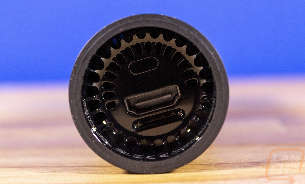
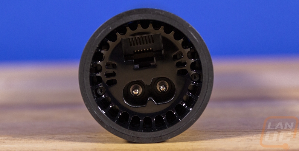
So here is a look at the ends where all of the connections are. You can see that both ends have ventilation and there is a small fan inside to keep things cool. One end has the HDMI connection which is the same HDMI 2.0b as the previous model with 4K and HDR support. That end also has the microSD card slot right below it and the hole at the top is a Kensington lock hole for if someone taking this (it is small enough to toss in a pocket) a concern. The other end has a gig ethernet port and the two-pin power connection. I have to point out that not only did they drop the big power brick of the past designs, but they also managed to make the design smaller while integrating that inside of the Shield TV which is cool. Sadly this small design drops the two USB ports that the previous models have had which is a slight issue for my current setup which has the Samsung SmartThings dongle plugged into and it also eliminates the possibility of storing media on an external USB drive or hard drive. Which is a BIG loss IMO. I wish they were able to slip a type-C connection in at least, even if it was on the side, not the end.
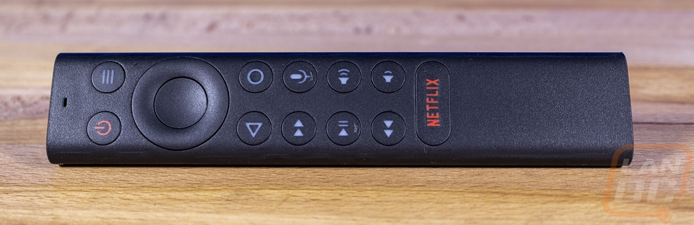
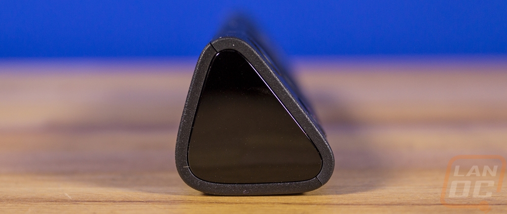
The other big change and what I was honestly most excited about were big changes to the remote design. The original and the 2017 models both had a remote that was similar to what a Firestick and an Apple TV would have with a thin design and a basic direction pad and back and menu buttons along with a touch slider for volume. The 2017 model dropped the rechargeable battery for a normal battery and that was a big improvement. But as someone who uses it all the time, I HATE the sliding volume control. It is way to sensitive and because the remote goes to sleep you have to touch it multiple times to bump the volume up or down in the middle of watching something. The new remote is more substantial and thicker with a triangle-like shape. It is also longer and they dropped the volume slider for actual buttons. You also now get play and pause buttons, skip forward and back, and a proper power button. They also included a Netflix button which I would be okay without it having, but it does follow the same trend as Roku remotes that have the same thing. It just gets weird when there are buttons for apps that later vanish like PlayStation Vue. A non-labeled button that could be programmed to open any app of your choice would be much better in my opinion. The new design is a lot nicer to hold, but I will say that I would prefer the triangle shape actually be flat on the bottom like an isosceles trapezoid which would feel better in your hand and sit flat as well. The current shape when you hold it tight tries to spin in your hand.
Okay, so I’ve been lucky enough to test the original Shield TV, the 2017 non-pro model, and now the 2019 non-pro model as well. I had to get all three together to show how much things have changed. Even going from the original to the 2017 model you can see a big size difference. But with the 2019 next to them both I still can’t believe they packed a similar setup into it!